The CBO report on Trump’s terrible new budget

Jun 8 JDN 2460835

And now back to our regularly scheduled programming. We’re back to talking about economics, which in our current environment pretty much always means bad news. The budget the House passed is pretty much the same terrible one Trump proposed.

The Congressional Budget Office (CBO), one of those bureaucratic agencies that most people barely even realize exists, but is actually extremely useful, spectacularly competent, and indeed one of the most important and efficient agencies in the world, has released its official report on the Trump budget that recently passed the House. (Other such agencies include the Bureau of Labor Statistics and the Bureau of Economic Analysis. US economic statistics are among the best in the world—some refer to them as the “gold standard”, but I refuse to insult them in that way.)

The whole thing is pretty long, but you can get a lot of the highlights from the summary tables.

The tables are broken down by the House committee responsible for choosing them; here are the effects on the federal budget deficit the CBO predicts for the next 5 and 10 years. For these numbers, positive means more deficit (bad), negative means less deficit (good).

Commitee5 years10 years
Agriculture-88,304-238,238
Armed Services124,602143,992
Education and Workforce-253,295-349,142
Energy and Commerce-247,074-995,062
Financial Services-373-5,155
Homeland Security27,87467,147
Judiciary26,9896,910
Natural Resources-4,789-20,158
Oversight and Government Reform-17,449-50,951
Transportation and Infrastructure-361-36,551
Ways and Means2,199,4033,767,402

These are in units of millions of dollars.

Almost all the revenue comes from the Ways and Means committee, because that’s the committee that sets tax rates. (If you hate your taxes, don’t hate the IRS; hate the Ways and Means Committee.) So for all the other departments, we can basically take the effect on the deficit as how much spending was changing.

If this budget makes it through the Senate, Trump will almost certainly sign it into law. If that happens:

We’ll be cutting $238 billion from Agriculture Committee programs: And most of where those cuts come from are programs that provide food for poor people.

We’ll be adding $144 billion to the military budget, and a further $67 billion to “homeland security” (which here mostly means CBP and ICE). Honestly, I was expecting more, so I’m vaguely relieved.

We’ll be cutting $349 billion from Education and Workforce programs; this is mostly coming from the student loan system, so we can expect much more brutal repayment requirements for people with student loans.

We’ll be cutting almost $1 trillion from Energy and Commerce programs; this is mainly driven by massive cuts to Medicare and Medicaid (why are they handled by this committee? I don’t know).
The bill itself doesn’t clearly specify, so the CBO issued another report offering some scenarios for how these budget cuts could be achieved. Every single scenario results in millions of people losing coverage, and the one that saves the most money would result in 5.5 million people losing some coverage and 2.4 million becoming completely uninsured.

The $20 billion from Natural Resources mostly involves rolling back environmental regulations, cutting renewable energy subsidies, and making it easier to lease federal lands for oil and gas drilling. All of these are bad, and none of them are surprising; but their effect on the budget is pretty small.

The Oversight and Government Reform portion is reducing the budget deficit by $51 billion mainly by forcing federal employees to contribute a larger share of their pensions—which is to say, basically cutting federal salaries across the board. While this has a small effect on the budget, it will impose substantial harm on the federal workforce (which has already been gutted by DOGE).

The Transportation and Infrastructure changes involve expansions of the Coast Guard (why are they not in Armed Services again?) along with across-the-board cuts of anything resembling support for sustainability or renewable energy; but the main way they actually decrease the deficit is by increasing the cost of registering cars. I think they’re trying to look like they are saving money by cutting “wasteful” (read: left-wing) programs, but in fact they mainly just made it more expensive to own a car—which, quite frankly, is probably a good thing from an environmental perspective.

Then, last but certainly not least, we come to the staggering $3.7 trillion increase in our 10-year deficit from the Ways and Means committee. What is this change that is more than 3 times as expensive as all the savings from the other departments combined?

Cutting taxes on rich people.

They are throwing some bones to the rest of the population, such as removing the taxes on tips and overtime (temporarily), and making a bunch of other changes to the tax code in terms of deductions and credits and such (because that’s what we needed, a more complicated tax code!); but the majority of the decrease in revenue comes from cutting income taxes, especially at the very highest brackets.

The University of Pennsylvania estimates that the poorest 40% of the population will actually see their after-tax incomes decrease as a result of the bill. Those in the 40% to 80% percentiles will see very little change. Only those in the richest 20% will see meaningful increases in income, and those will be highest for the top 5% and above.

The 95-99% percentile will see the greatest proportional gain, 3.5% of their income.

But the top 0.1% will see by far the greatest absolute gain, each gaining an average of $385,000 per year. Every one of these people already has an annual income of at least $4 million.

The median price of a house in the United States is $416,000.

That is, we are basically handing a free house to every millionaire in America—every year for the next 10 years.

That is why we’re adding $3.7 trillion to the national debt. So that the top 0.1% can have free houses.

Without these tax cuts, the new budget would actually reduce the deficit—which is really something we ought to be doing, because we’re running a deficit of $1.8 trillion per year and we’re not even in a recession. But because Republicans love nothing more than cutting taxes on the rich—indeed, sometimes it seems it is literally the only thing they care about—we’re going to make the deficit even bigger instead.

I can hope this won’t make it through the Senate, but I’m not holding my breath.

How do we stop overspending on healthcare?

Dec 10 JDN 2460290

I don’t think most Americans realize just how much more the US spends on healthcare than other countries. This is true not simply in absolute terms—of course it is, the US is rich and huge—but in relative terms: As a portion of GDP, our healthcare spending is a major outlier.

Here’s a really nice graph from Healthsystemtracker.org that illustrates it quite nicely: Almost all other First World countries share a simple linear relationship between their per-capita GDP and their per-capita healthcare spending. But one of these things is not like the other ones….

The outlier in the other direction is Ireland, but that’s because their GDP is wildly inflated by Leprechaun Economics. (Notice that it looks like Ireland is by far the richest country in the sample! This is clearly not the case in reality.) With a corrected estimate of their true economic output, they are also quite close to the line.

Since US GDP per capita ($70,181) is in between that of Denmark ($64,898) and Norway ($80,496) both of which have very good healthcare systems (#ScandinaviaIsBetter), we would expect that US spending on healthcare would similarly be in between. But while Denmark spends $6,384 per person per year on healthcare and Norway spends $7,065 per person per year, the US spends $12,914.

That is, the US spends nearly twice as much as it should on healthcare.

The absolute difference between what we should spend and what we actually spend is nearly $6,000 per person per year. Multiply that out by the 330 million people in the US, and…

The US overspends on healthcare by nearly $2 trillion per year.

This might be worth it, if health in the US were dramatically better than health in other countries. (In that case I’d be saying that other countries spend too little.) But plainly it is not.

Probably the simplest and most comparable measure of health across countries is life expectancy. US life expectancy is 76 years, and has increased over time. But if you look at the list of countries by life expectancy, the US is not even in the top 50. Our life expectancy looks more like middle-income countries such as Algeria, Brazil, and China than it does like Norway or Sweden, who should be our economic peers.

There are of course many things that factor into life expectancy aside from healthcare: poverty and homicide are both much worse in the US than in Scandinavia. But then again, poverty is much worse in Algeria, and homicide is much worse in Brazil, and yet they somehow manage to nearly match the US in life expectancy (actually exceeding it in some recent years).

The US somehow manages to spend more on healthcare than everyone else, while getting outcomes that are worse than any country of comparable wealth—and even some that are far poorer.

This is largely why there is a so-called “entitlements crisis” (as many a libertarian think tank is fond of calling it). Since libertarians want to cut Social Security most of all, they like to lump it in with Medicare and Medicaid as an “entitlement” in “crisis”; but in fact we only need a few minor adjustments to the tax code to make sure that Social Security remains solvent for decades to come. It’s healthcare spending that’s out of control.

Here, take a look.

This is the ratio of Social Security spending to GDP from 1966 to the present. Notice how it has been mostly flat since the 1980s, other than a slight increase in the Great Recession.

This is the ratio of Medicare spending to GDP over the same period. Even ignoring the first few years while it was ramping up, it rose from about 0.6% in the 1970s to almost 4% in 2020, and only started to decline in the last few years (and it’s probably too early to say whether that will continue).

Medicaid has a similar pattern: It rose steadily from 0.2% in 1966 to over 3% today—and actually doesn’t even show any signs of leveling off.

If you look at Medicare and Medicaid together, they surged from just over 1% of GDP in 1970 to nearly 7% today:

Put another way: in 1982, Social Security was 4.8% of GDP while Medicare and Medicaid combined were 2.4% of GDP. Today, Social Security is 4.9% of GDP while Medicare and Medicaid are 6.8% of GDP.

Social Security spending barely changed at all; healthcare spending more than doubled. If we reduced our Medicare and Medicaid spending as a portion of GDP back to what it was in 1982, we would save 4.4% of GDP—that is, 4.4% of over $25 trillion per year, so $1.1 trillion per year.

Of course, we can’t simply do that; if we cut benefits that much, millions of people would suddenly lose access to healthcare they need.

The problem is not that we are spending frivolously, wasting the money on treatments no one needs. On the contrary, both Medicare and Medicaid carefully vet what medical services they are willing to cover, and if anything probably deny services more often than they should.

No, the problem runs deeper than this.

Healthcare is too expensive in the United States.

We simply pay more for just about everything, and especially for specialist doctors and hospitals.

In most other countries, doctors are paid like any other white-collar profession. They are well off, comfortable, certainly, but few of them are truly rich. But in the US, we think of doctors as an upper-class profession, and expect them to be rich.

Median doctor salaries are $98,000 in France and $138,000 in the UK—but a whopping $316,000 in the US. Germany and Canada are somewhere in between, at $183,000 and $195,000 respectively.

Nurses, on the other hand, are paid only a little more in the US than in Western Europe. This means that the pay difference between doctors and nurses is much higher in the US than most other countries.

US prices on brand-name medication are frankly absurd. Our generic medications are typically cheaper than other countries, but our brand name pills often cost twice as much. I noticed this immediately on moving to the UK: I had always been getting generics before, because the brand name pills cost ten times as much, but when I moved here, suddenly I started getting all brand-name medications (at no cost to me), because the NHS was willing to buy the actual brand name products, and didn’t have to pay through the nose to do so.

But the really staggering differences are in hospitals.

Let’s compare the prices of a few inpatient procedures between the US and Switzerland. Switzerland, you should note, is a very rich country that spends a lot on healthcare and has nearly the world’s highest life expectancy. So it’s not like they are skimping on care. (Nor is it that prices in general are lower in Switzerland; on the contrary, they are generally higher.)

A coronary bypass in Switzerland costs about $33,000. In the US, it costs $76,000.

A spinal fusion in Switzerland costs about $21,000. In the US? $52,000.

Angioplasty in Switzerland: $9.000. In the US? $32,000.

Hip replacement: Switzerland? $16,000. The US? $28,000.

Knee replacement: Switzerland? $19,000. The US? $27,000.

Cholecystectomy: Switzerland? $8,000. The US? $16,000.

Appendectomy: Switzerland? $7,000. The US? $13,000.

Caesarian section: Switzerland? $8,000. The US? $11,000.

Hospital prices are even lower in Germany and Spain, whose life expectancies are not as high as Switzerland—but still higher than the US.

These prices are so much lower that in fact if you were considering getting surgery for a chronic condition in the US, don’t. Buy plane tickets to Europe and get the procedure done there. Spend an extra few thousand dollars on a nice European vacation and you’d still end up saving money. (Obviously if you need it urgently you have no choice but to use your nearest hospital.) I know that if I ever need a knee replacement (which, frankly, is likely, given my height), I’m gonna go to Spain and thereby save $22,000 relative to what it would cost in the US. That’s a difference of a car.

Combine this with the fact that the US is the only First World country without universal healthcare, and maybe you can see why we’re also the only country in the world where people are afraid to call an ambulance because they don’t think they can afford it. We are also the only country in the world with a medical debt crisis.

Where is all this extra money going?

Well, a lot of it goes to those doctors who are paid three times as much as in France. That, at least, seems defensible: If we want the best doctors in the world maybe we need to pay for them. (Then again, do we have the best doctors in the world? If so, why is our life expectancy so mediocre?)

But a significant portion is going to shareholders.

You probably already knew that there are pharmaceutical companies that rake in huge profits on those overpriced brand-name medications. The top five US pharma companies took in net earnings of nearly $82 billion last year. Pharmaceutical companies typically take in much higher profit margins than other companies: a typical corporation makes about 8% of its revenue in profit, while pharmaceutical companies average nearly 14%.

But you may not have realized that a surprisingly large proportion of hospitals are for-profit businesseseven though they make most of their revenue from Medicare and Medicaid.

I was surprised to find that the US is not unusual in that; in fact, for-profit hospitals exist in dozens of countries, and the fraction of US hospital capacity that is for-profit isn’t even particularly high by world standards.

What is especially large is the profits of US hospitals. 7 healthcare corporations in the US all posted net incomes over $1 billion in 2021.

Even nonprofit US hospitals are tremendously profitable—as oxymoronic as that may sound. In fact, mean operating profit is higher among nonprofit hospitals in the US than for-profit hospitals. So even the hospitals that aren’t supposed to be run for profit… pretty much still are. They get tax deductions as if they were charities—but they really don’t act like charities.

They are basically nonprofit in name only.

So fixing this will not be as simple as making all hospitals nonprofit. We must also restructure the institutions so that nonprofit hospitals are genuinely nonprofit, and no longer nonprofit in name only. It’s normal for a nonprofit to have a little bit of profit or loss—nobody can make everything always balance perfectly—but these hospitals have been raking in huge profits and keeping it all in cash instead of using it to reduce prices or improve services. In the study I linked above, those 2,219 “nonprofit” hospitals took in operating profits averaging $43 million each—for a total of $95 billion.

Between pharmaceutical companies and hospitals, that’s a total of over $170 billion per year just in profit. (That’s more than we spend on food stamps, even after surge due to COVID.) This is pure grift. It must be stopped.

But that still doesn’t explain why we’re spending $2 trillion more than we should! So after all, I must leave you with a question:

What is America doing wrong? Why is our healthcare so expensive?

What most Americans think about government spending

Oct 22 JDN 2460240

American public opinion on government spending is a bit of a paradox. People say the government spends too much, but when you ask them what to cut, they don’t want to cut anything in particular.

This is how various demographics answer when you ask if, overall, the government spends “too much”, “too little”, or “about right”:

Democrats have a relatively balanced view, with about a third in each category. Republicans overwhelmingly agree that the government spends too much.

Let’s focus on the general population figures: 60% of Americans believe the government spends too much, 22% think it is about right, and only 16% think it spends too little. (2% must not have answered.)

This question is vague about how much people would like to see the budget change. So it’s possible people only want a moderate decrease. But they must at least want enough to justify not being in the “about right” category, which presumably allows for at least a few percent of wiggle room in each direction.

I think a reasonable proxy of how much people want the budget to change is the net difference in opinion between “too much” and “too little”: So for Democrats this is 34 – 27 = 7%. For the general population it is 60 – 16 = 44%; and for Republicans it is 88 – 6 = 82%.

To make this a useful proxy, I need to scale it appropriately. Republicans in Congress say they want to cut federal spending by $1 trillion per year, so that would be a reduction of 23%. So, for a reasonable proxy, I think ([too little] – [too much])/4 is about the desired amount of change.

Of course, it’s totally possible for 88% of people to agree that the budget should be cut 10%, and none of them to actually want the budget to be cut 22%. But without actually having survey data showing how much people want to cut the budget, the proportion who want it to be cut is the best proxy I have. And it definitely seems like most people want the budget to be cut.

But cut where? What spending do people want to actually reduce?

Not much, it turns out:

Overwhelming majorities want to increase spending on education, healthcare, social security, infrastructure, Medicare, and assistance to the poor. The plurality want to increase spending on border security, assistance for childcare, drug rehabilitation, the environment, and law enforcement. Overall opinion on military spending and scientific research seems to be that it’s about right, with some saying too high and others too low. That’s… almost the entire budget.

This AP NORC poll found only three areas with strong support for cuts: assistance to big cities, space exploration, and assistance to other countries.

The survey just asked about “the government”, so people may be including opinions on state and local spending as well as federal spending. But let’s just focus for now on federal spending.

Here is what the current budget looks like, divided as closely as I could get it into the same categories that the poll asked about:

The federal government accounts for only a tiny portion of overall government spending on education, so for this purpose I’m just going to ignore that category; anything else would be far too misleading. I had to separately look up border security, foreign aid, space exploration, and scientific research, as they are normally folded into other categories. I decided to keep the medical research under “health” and military R&D under “military”, so the “scientific research” includes all other sciences—and as you’ll note, it’s quite small.

“Regional Development” includes but is by no means limited to aid to big cities; in fact, most of it goes to rural areas. With regard to federal spending, “Transportation” is basically synonymous with “Infrastructure”, so I’ll treat those as equivalent. Federal spending directly on environmental protection is so tiny that I couldn’t even make a useful category for it; for this purpose, I guess I’ll just assume it’s most of “Other” (though it surely isn’t).

As you can see, the lion’s share of the federal budget goes to three things: healthcare (including Medicare), Social Security, and the military. (As Krugman is fond of putting it: “The US government is an insurance company with an army.”)

Assistance to the poor is also a major category, and as well it should be. Debt interest is also pretty substantial, especially now that interest rates have increased, but that’s not really optional; the global financial system would basically collapse if we ever stopped paying that. The only realistic way to bring that down is to balance the budget so that we don’t keep racking up more debt.

After that… it’s all pretty small, relatively speaking. I mean, these are still tens of billions of dollars. But the US government is huge. When you spend $1.24 trillion (that’s $1,240 billion) on Social Security, that $24 billion for space exploration really doesn’t seem that big.

So, that’s what the budget actually looks like. What do people want it to look like? Well on the one hand, they seem to want to cut it. My admittedly very rough estimate suggests they want to cut it about 11%, which would reduce the total from $4.3 trillion to $3.8 trillion. That’s what they say if you ask about the budget as a whole.

But what if we listen to what they say about particular budget categories? Using my same rough estimate, people want to increase spending on healthcare by 12%, spending on Social Security by 14%, and so on.

The resulting new budget looks like this:

Please note two things:

  1. The overall distribution of budget priorities has not substantially changed.
  2. The total amount of spending is in fact moderately higher.

This new budget would be disastrous for Ukraine, painful for NASA, and pleasant for anyone receiving Social Security benefits; but our basic budget outlook would be unchanged. Total spending would rise to $4.6 trillion, about $300 billion more than what we are currently spending.

The things people say they want to cut wouldn’t make a difference: We could stop all space missions immediately and throw Ukraine completely under the bus, and it wouldn’t make a dent in our deficit.

This leaves us with something of a paradox: If you ask them in general what they want to do with the federal budget, the majority of Americans say they want to cut it, often drastically. But if you ask them about any particular budget category, they mostly agree that things are okay, or even want them to be increased. Moreover, it is some of the largest categories of spending—particularly healthcare and Social Security—that often see the most people asking for increases.

I think this tells us some good news and some bad news.

The bad news is that most Americans are quite ignorant about how government money is actually spent. They seem to imagine that huge amounts are frittered away frivolously on earmarks; they think space exploration is far more expensive than it is; they wildly overestimate how much we give in foreign aid; they clearly don’t understand the enormous benefits of funding basic scientific research. Most people seem to think that there is some enormous category of totally wasted money that could easily be saved through more efficient spending—and that just doesn’t seem to be the case. Maybe government spending could be made more efficient, but if so, we need an actual plan for doing that. We can’t just cut budgets and hope for a miracle.

The good news is that our political system, for all of its faults, actually seems to have resulted in a government budget that broadly reflects the actual priorities of our citizenry. On budget categories people like, such as Social Security and Medicare, we are already spending a huge amount. On budget categories people dislike, such as earmarks and space exploration, we are already spending very little. We basically already have the budget most Americans say they want to have.

What does this mean for balancing the budget and keeping the national debt under control?

It means we have to raise taxes. There just isn’t anything left to cut that wouldn’t be wildly unpopular.

This shouldn’t really be shocking. The US government already spends less as a proportion of GDP than most other First World countries [note: I’m using 2019 figures because recent years were distorted by COVID]. Ireland’s figures are untrustworthy due to their inflated leprechaun GDP; so the only unambiguously First World country that clearly has lower government spending than the US is Switzerland. We spend about 38%, which is still high by global standards—but as well it should be, we’re incredibly rich. And this is quite a bit lower than the 41% they spend in the UK or the 45% they spend in Germany, let alone the 49% they spend in Sweden or the whopping 55% they spend in France.

Of course, Americans really don’t like paying taxes either. But at some point, we’re just going to have to decide: Do we want fewer services, more debt, or more taxes? Because those are really our only options. I for one think we can handle more taxes.

Tax plan possibilities

Mar 26, JDN 2457839

Recently President Trump (that phrase may never quite feel right) began presenting his new tax plan. To be honest, it’s not as ridiculous as I had imagined it might be. I mean, it’s still not very good, but it’s probably better than Reagan’s tax plan his last year in office, and it’s not nearly as absurd as the half-baked plan Trump originally proposed during the campaign.

But it got me thinking about the incredible untapped potential of our tax system—the things we could achieve as a nation, if we were willing to really commit to them and raise taxes accordingly.

A few years back I proposed a progressive tax system based upon logarithmic utility. I now have a catchy name for that tax proposal; I call it the logtax. It depends on two parameters—a poverty level, at which the tax rate goes to zero; and what I like to call a metarate—the fundamental rate that sets all the actual tax rates by the formula.

For the poverty level, I suggest we use the highest 2-household poverty level set by the Department of Health and Human Services: Because of Alaska’s high prices, that’s the Alaska poverty level, and the resulting figure is $20,290—let’s round to $20,000.

I would actually prefer to calculate taxes on an individual basis—I see no reason to incentivize particular household arrangements—but as current taxes are calculated on a household basis, I’m going to use that for now.

The metarate can be varied, and in the plans below I will compare different options for the metarate.

I will compare six different tax plans:

  1. Our existing tax plan, set under the Obama administration
  2. Trump’s proposed tax plan
  3. A flat rate of 30% with a basic income of $12,000, replacing welfare programs and Medicaid
  4. A flat rate of 40% with a basic income of $15,000, replacing welfare programs and Medicaid
  5. A logtax with a metarate of 20%, all spending intact
  6. A logtax with a metarate of 25% and a basic income of $12,000, replacing welfare programs and Medicaid
  7. A logtax with a metarate of 35% and a basic income of $15,000, cutting military spending by 50% and expanding Medicare to the entire population while eliminating Medicare payroll taxes

To do a proper comparison, I need estimates of the income distribution in the United States, in order to properly estimate the revenue from each type of tax. For that I used US Census data for most of the income data, supplementing with the World Top Incomes database for the very highest income brackets. The household data is broken up into brackets of $5,000 and only goes up to $250,000, so it’s a rough approximation to use the average household income for each bracket, but it’s all I’ve got.

The current brackets are 10%, 15%, 25%, 28%, 33%, 35%, and 39.6%. These are actually marginal rates, not average rates, which makes the calculation a lot more complicated. I did it properly though; for example, when you start paying the marginal rate of 28%, your average rate is really only 20.4%.

Worst of all, I used static scoring—that is, I ignored the Laffer Effect by which increasing taxes changes incentives and can change pre-tax incomes. To really do this analysis properly, one should use dynamic scoring, taking these effects into account—but proper dynamic scoring is an enormous undertaking, and this is a blog post, not my dissertation.

Still, I was able to get pretty close to the true figures. The actual federal budget shows total revenue net of payroll taxes to be $2.397 trillion, whereas I estimated $2.326 trillion; the true deficit is $608 billion and I estimated $682 billion.

Under Trump’s tax plan, almost all rates are cut. He also plans to remove some deductions, but all reports I could find on the plan were vague as to which ones, and with data this coarse it’s very hard to get any good figures on deduction amounts anyway. I also want to give him credit where it’s due: It was a lot easier to calculate the tax rates under Trump’s plan (but still harder than under mine…). But in general what I found was the following:

Almost everyone pays less income tax under Trump’s plan, by generally about 4-5% of their income. The poor benefit less or are slightly harmed; the rich benefit a bit more.

For example, a household in poverty making $12,300 would pay $1,384 currently, but $1,478 under Trump’s plan, losing $94 or 0.8% of their income. An average household making $52,000 would pay $8,768 currently but only $6,238 under Trump’s plan, saving $2,530 or about 4.8% of their income. A household making $152,000 would pay $35,580 currently but only $28,235 under Trump’s plan, saving $7,345 or again about 4.8%. A top 1% household making $781,000 would pay $265,625 currently, but only $230,158 under Trump’s plan, saving $35,467 or about 4.5%. A top 0.1% household making $2,037,000 would pay $762,656 currently, but only $644,350 under Trump’s plan, saving $118,306 or 5.8% of their income. A top 0.01% household making $9,936,000 would pay $3,890,736 currently, but only $3,251,083 under Trump’s plan, saving $639,653 or 6.4% of their income.

Because taxes are cut across the board, Trump’s plan would raise less revenue. My static scoring will exaggerate this effect, but only moderately; my estimate says we would lose over $470 billion in annual revenue, while the true figure might be $300 billion. In any case, Trump will definitely increase the deficit substantially unless he finds a way to cut an awful lot of spending elsewhere—and his pet $54 billion increase to the military isn’t helping in that regard. My estimate of the new deficit under Trump’s plan is $1.155 trillion—definitely not the sort of deficit you should be running during a peacetime economic expansion.

Let’s see what we might have done instead.

If we value simplicity and ease of calculation, it’s hard to beat a flat tax plus basic income. With a flat tax of 30% and a basic income of $12,000 per household, the poor do much better off because of the basic income, while the rich do a little better because of the flat tax, and the middle class feels about the same because the two effects largely cancel. Calculating your tax liability now couldn’t be easier; multiply your income by 3, remove a zero—that’s what you owe in taxes. And how much do you get in basic income? The same as everyone else, $12,000.

Using the same comparison households: The poor household making $12,300 would now receive $8,305—increasing their income by $9,689 or 78.8% relative to the current system. The middle-class household making $52,000 would pay $3,596, saving $5,172 or 10% of their income. The upper-middle-class household making $152,000 would now pay $33,582, saving only $1998 or 1.3% of their income. The top 1% household making $782,000 would pay $234,461, saving $31,164 or 4.0%. The top 0.1% household making $2,037,000 would pay $611,000, saving $151,656 or 7.4%. Finally, the top 0.01% household making $9,936,000 would pay $2,980,757, saving $910,000 or 9.1%.

Thus, like Trump’s plan, the tax cut almost across the board results in less revenue. However, because of the basic income, we can now justify cutting a lot of spending on social welfare programs. I estimated we could reasonably save about $630 billion by cutting Medicaid and other social welfare programs, while still not making poor people worse off because of the basic income. The resulting estimated deficit comes in at $1.085 trillion, which is still too large—but less than what Trump is proposing.

If I raise the flat rate to 40%—just as easy to calculate—I can bring that deficit down, even if I raise the basic income to $15,000 to compensate. The poverty household now receives $10,073, and the other representative households pay $5,974; $45,776; $297,615; $799,666; and $3,959,343 respectively. This means that the poor are again much better off, the middle class are about the same, and the rich are now substantially worse off. But what’s our deficit now? $180 billion—that’s about 1% of GDP, the sort of thing you can maintain indefinitely with a strong currency.

Can we do better than this? I think we can, with my logtax.

I confess that the logtax is not quite as easy to calculate as the flat tax. It does require taking exponents, and you can’t do it in your head. But it’s actually still easier than the current system, because there are no brackets to keep track of, no discontinuous shifts in the marginal rate. It is continuously progressive for all incomes, and the same formula can be used for all incomes from zero to infinity.
The simplest plan just replaces the income tax with a logtax of 20%. The poor household now receives $1,254, just from the automatic calculation of the tax—no basic income was added. The middle-class household pays $9,041, slightly more than what they are currently paying. Above that, people start paying more for sure: $50,655; $406,076; $1,228,795; and $7,065,274 respectively.

This system is obviously more progressive, but does it raise sufficient revenue? Why, as a matter of fact it removes the deficit entirely. The model estimates that the budget would now be at surplus of $110 billion. This is probably too optimistic; under dynamic scoring the distortions are probably going to cut the revenue a little. But it would almost certainly reduce the deficit, and very likely eliminate it altogether—without any changes in spending.

The next logtax plan adds a basic income of $12,000. To cover this, I raised the metarate to 25%. Now the poor household is receiving $11,413, the middle-class household is paying a mere $1,115, and the other households are paying $50,144; $458,140; $1,384,475; and $7,819,932 respectively. That top 0.01% household isn’t going to be happy, as they are now paying 78% of their income where in our current system they would pay only 39%. But their after-tax income is still over $2 million.

How does the budget look now? As with the flat tax plan, we can save about $630 billion by cutting redundant social welfare programs. So we are once again looking at a surplus, this time of about $63 billion. Again, the dynamic scoring might show some deficit, but definitely not a large one.

Finally, what if I raise the basic income to $15,000 and raise the metarate to 35%? The poor household now receives $14,186, while the median household pays $2,383. The richer households of course foot the bill, paying $64,180; $551,031; $1,618,703; and $8,790,124 respectively. Oh no, the top 0.01% household will have to make do with only $1.2 million; how will they survive!?

This raises enough revenue that it allows me to do some even more exciting things. With a $15,000 basic income, I can eliminate social welfare programs for sure. But then I can also cut military spending, say in half—still leaving us the largest military in the world. I can move funds around to give Medicare to every single American, an additional cost of about twice what we currently pay for Medicare. Then Medicaid doesn’t just get cut; it can be eliminated entirely, folded into Medicare. Assuming that the net effect on total spending is zero, the resulting deficit is estimated at only $168 billion, well within the range of what can be sustained indefinitely.

And really, that’s only the start. Once you consider all the savings on healthcare spending—an average of $4000 per person per year, if switching to single-payer brings us down to the average of other highly-developed countries. This is more than what the majority of the population would be paying in taxes under this plan—meaning that once you include the healthcare benefits, the majority of Americans would net receive money from the government. Compared to our current system, everyone making under about $80,000 would be better off. That is what we could be doing right now—free healthcare for everyone, a balanced budget (or close enough), and the majority of Americans receiving more from the government than they pay in taxes.

These results are summarized in the table below. (I also added several more rows of representative households—though still not all the brackets I used!) I’ve color-coded who would be paying less in tax in green and who would be more in tax in red under each plan, compared to our current system. This color-coding is overly generous to Trump’s plan and the 30% flat tax plan, because it doesn’t account for the increased government deficit (though I did color-code those as well, again relative to the current system). And yet, over 50% of households make less than $51,986, putting the poorest half of Americans in the green zone for every plan except Trump’s. For the last plan, I also color-coded those between $52,000 and $82,000 who would pay additional taxes, but less than they save on healthcare, thus net saving money in blue. Including those folks, we’re benefiting over 69% of Americans.

Household

pre-tax income

Current tax system Trump’s tax plan Flat 30% tax with $12k basic income Flat 40% tax with $15k basic income Logtax 20% Logtax 25% with $12k basic income Logtax 35% with $15k basic income, single-payer healthcare
$1,080 $108 $130 -$11,676 -$14,568 -$856 -$12,121 -$15,173
$12,317 $1,384 $1,478 -$8,305 -$10,073 -$1,254 -$11,413 -$14,186
$22,162 $2,861 $2,659 -$5,351 -$6,135 $450 -$9,224 -$11,213
$32,058 $4,345 $3,847 -$2,383 -$2,177 $2,887 -$6,256 -$7,258
$51,986 $8,768 $6,238 $3,596 $5,794 $9,041 $1,115 $2,383
$77,023 $15,027 $9,506 $11,107 $15,809 $18,206 $11,995 $16,350
$81,966 $16,263 $10,742 $12,590 $17,786 $20,148 $14,292 $17,786
$97,161 $20,242 $14,540 $17,148 $23,864 $26,334 $21,594 $28,516
$101,921 $21,575 $15,730 $18,576 $27,875 $30,571 $23,947 $31,482
$151,940 $35,580 $28,235 $33,582 $45,776 $50,655 $50,144 $64,180
$781,538 $265,625 $230,158 $222,461 $297,615 $406,076 $458,140 $551,031
$2,036,666 $762,656 $644,350 $599,000 $799,666 $1,228,795 $1,384,475 $1,618,703
$9,935,858 $3,890,736 $3,251,083 $2,968,757 $3,959,343 $7,065,274 $7,819,932 $8,790,124
Change in federal spending $0 $0 -$630 billion -$630 billion $0 -$630 billion $0
Estimated federal surplus -$682 billion -$1,155 billion -$822 billion -$180 billion $110 billion $63 billion -$168 billion

The unending madness of the gold standard

JDN 2457545

If you work in economics in any capacity (much like “How is the economy doing?” you don’t even really need to be in macroeconomics), you will encounter many people who believe in the gold standard. Many of these people will be otherwise quite intelligent and educated; they often understand economics better than most people (not that this is saying a whole lot). Yet somehow they continue to hold—and fiercely defend—this incredibly bizarre and anachronistic view of macroeconomics.

They even bring it up at the oddest times; I recently encountered someone who wrote a long and rambling post arguing for drug legalization (which I largely agree with, by the way) and concluded it with #EndTheFed, not seeming to grasp the total and utter irrelevance of this juxtaposition. It seems like it was just a conditioned response, or maybe the sort of irrelevant but consistent coda originally perfected by Cato and his “Carthago delenda est. “Foederale Reservatum delendum est. Hey, maybe that’s why they’re called the Cato Institute.

So just how bizarre is the gold standard? Well, let’s look at what sort of arguments they use to defend it. I’ll use Charles Kadlic, prominent Libertarian blogger on Forbes, as an example, with his “Top Ten Reasons That You Should Support the ‘Gold Commission’”:

  1. A gold standard is key to achieving a period of sustained, 4% real economic growth.
  2. A gold standard reduces the risk of recessions and financial crises.
  3. A gold standard would restore rising living standards to the middle-class.
  4. A gold standard would restore long-term price stability.
  5. A gold standard would stop the rise in energy prices.
  6. A gold standard would be a powerful force for restoring fiscal balance to federal state and local governments.
  7. A gold standard would help save Medicare and Social Security.
  8. A gold standard would empower Main Street over Wall Street.
  9. A gold standard would increase the liberty of the American people.
  10. Creation of a gold commission will provide the forum to chart a prudent path toward a 21st century gold standard.

Number 10 can be safely ignored, as clearly Kadlic just ran out of reasons and to make a round number tacked on the implicit assumption of the entire article, namely that this ‘gold commission’ would actually realistically lead us toward a gold standard. (Without it, the other 9 reasons are just non sequitur.)

So let’s look at the other 9, shall we? Literally none of them are true. Several are outright backward.

You know a policy is bad when even one of its most prominent advocates can’t even think of a single real benefit it would have. A lot of quite bad policies do have perfectly real benefits, they’re just totally outweighed by their costs: For example, cutting the top income tax rate to 20% probably would actually contribute something to economic growth. Not a lot, and it would cut a swath through the federal budget and dramatically increase inequality—but it’s not all downside. Yet Kadlic couldn’t actually even think of one benefit of the gold standard that actually holds up. (I actually can do his work for him: I do know of one benefit of the gold standard, but as I’ll get to momentarily it’s quite small and can easily be achieved in better ways.)

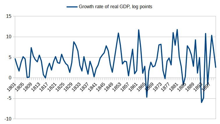
First of all, it’s quite clear that the gold standard did not increase economic growth. If you cherry-pick your years properly, you can make it seem like Nixon leaving the gold standard hurt growth, but if you look at the real long-run trends in economic growth it’s clear that we had really erratic growth up until about the 1910s (the surge of government spending in WW1 and the establishment of the Federal Reserve), at which point went through a temporary surge recovering from the Great Depression and then during WW2, and finally, if you smooth out the business cycle, our growth rates have slowly trended downward as growth in productivity has gradually slowed down.

Here’s GDP growth from 1800 to 1900, when we were on the classical gold standard:

US_GDP_growth_1800s

Here’s GDP growth from 1929 to today, using data from the Bureau of Economic Analysis:

US_GDP_growth_BEA

Also, both of these are total GDP growth (because that is what Kadlic said), which means that part of what you’re seeing here is population growth rather than growth in income per person. Here’s GDP per person in the 1800s:

US_GDP_growth_1800s

If you didn’t already know, I bet you can’t guess where on those graphs we left the gold standard, which you’d clearly be able to do if the gold standard had this dramatic “double your GDP growth” kind of effect. I can’t immediately rule out some small benefit to the gold standard just from this data, but don’t worry; more thorough economic studies have done that. Indeed, it is the mainstream consensus among economists today that the gold standard is what caused the Great Depression.

Indeed, there’s a whole subfield of historical economics research that basically amounts to “What were they thinking?” trying to explain why countries stayed on the gold standard for so long when it clearly wasn’t working. Here’s a paper trying to argue it was a costly signal of your “rectitude” in global bond markets, but I find much more compelling the argument that it was psychological: Their belief in the gold standard was simply too strong, so confirmation bias kept holding them back from what needed to be done. They were like my aforementioned #EndTheFed acquaintance.

Then we get to Kadlic’s second point: Does the gold standard reduce the risk of financial crises? Let’s also address point 4, which is closely related: Does the gold standard improve price stability? Tell that to 1929.

In fact, financial crises were more common on the classical gold standard; the period of pure fiat monetary policy was so stable that it was called the Great Moderation, until the crash in 2008 screwed it all up—and that crash occurred essentially outside the standard monetary system, in the “shadow banking system” of unregulated and virtually unlimited derivatives. Had we actually forced banks to stay within the light of the standard banking system, the Great Moderation might have continued indefinitely.

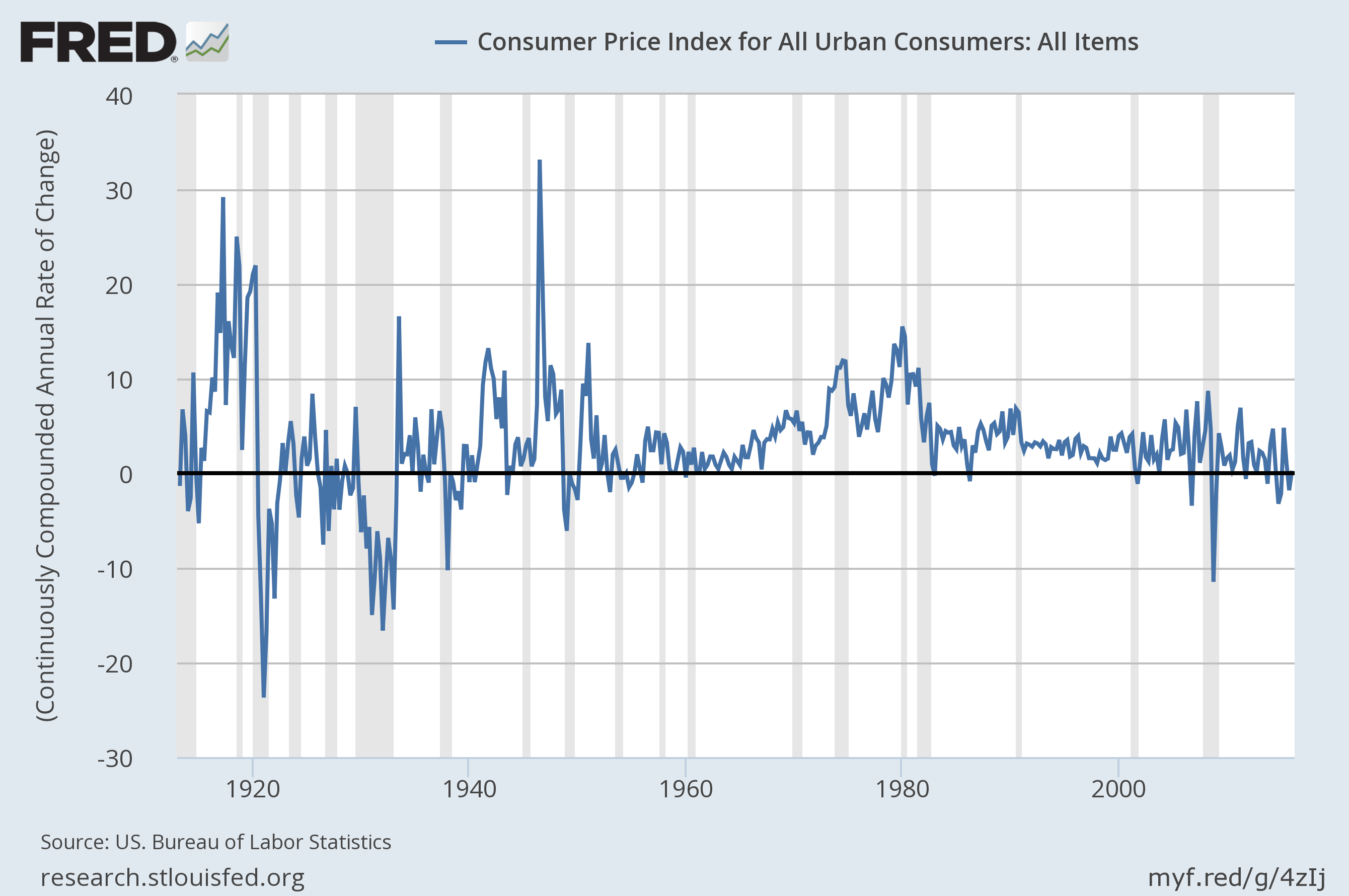
As for “price stability”, that’s sort of true if you look at the long run, because prices were as likely to go down as they were to go up. But that isn’t what we mean by “price stability”. A system with good price stability will have a low but positive and steady level of inflation, and will therefore exhibit some long-run increases in price levels; it won’t have prices jump up and down erratically and end up on average the same.

For jump up and down is what prices did on the gold standard, as you can see from FRED:

US_inflation_longrun

This is something we could have predicted in advance; the price of any given product jumps up and down over time, and gold is just one product among many. Tying prices to gold makes no more sense than tying them to any other commodity.

As for stopping the rise in energy prices, energy prices aren’t rising. Even if they were (and they could at some point), the only way the gold standard would stop that is by triggering deflation (and therefore recession) in the rest of the economy.

Regarding number 6, I don’t see how the fiscal balance of federal and state governments is improved by periodic bouts of deflation that make their debt unpayable.

As for number 7, saving Medicare and Social Security, their payments out are tied to inflation and their payments in are tied to nominal GDP, so overall inflation has very little effect on their long-term stability. In any case, the problem with Medicare is spiraling medical costs (which Obamacare has done a lot to fix), and the problem with Social Security is just the stupid arbitrary cap on the income subject to payroll tax; the gold standard would do very little to solve either of those problems, though I guess it would make the nominal income cap less binding by triggering deflation, which is just about the worst way to avoid a price ceiling I’ve ever heard.

Regarding 8 and 9, I don’t even understand why Kadlic thinks that going to a gold standard would empower individuals over banks (does it seem like individuals were empowered over banks in the “Robber Baron Era”?), or what in the world it has to do with giving people more liberty (all that… freedom… you lose… when the Fed… stabilizes… prices?), so I don’t even know where to begin on those assertions. You know what empowers people over banks? The Consumer Financial Protection Bureau. You know what would enhance liberty? Ending mass incarceration. Libertarians fight tooth and nail against the former; sometimes they get behind the latter, but sometimes they don’t; Gary Johnson for some bizarre reason believes in privatization of prisons, which are directly linked to the surge in US incarceration.

The only benefit I’ve been able to come up with for the gold standard is as a commitment mechanism, something the Federal Reserve could do to guarantee its future behavior and thereby reduce the fear that it will suddenly change course on its past promises. This would make forward guidance a lot more effective at changing long-term interest rates, because people would have reason to believe that the Fed means what it says when it projects its decisions 30 years out.

But there are much simpler and better commitment mechanisms the Fed could use. They could commit to a Taylor Rule or nominal GDP targeting, both of which mainstream economists have been clamoring for for decades. There are some definite downsides to both proposals, but also some important upsides; and in any case they’re both obviously better than the gold standard and serve the same forward guidance function.

Indeed, it’s really quite baffling that so many people believe in the gold standard. It cries out for some sort of psychological explanation, as to just what cognitive heuristic is failing when otherwise-intelligent and highly-educated people get monetary policy so deeply, deeply wrong. A lot of them don’t even to seem grasp when or how we left the gold standard; it really happened when FDR suspended gold convertibility in 1933. After that on the Bretton Woods system only national governments could exchange money for gold, and the Nixon shock that people normally think of as “ending the gold standard” was just the final nail in the coffin, and clearly necessary since inflation was rapidly eating through our gold reserves.

A lot of it seems to come down to a deep distrust of government, especially federal government (I still do not grok why the likes of Ron Paul think state governments are so much more trustworthy than the federal government); the Federal Reserve is a government agency (sort of) and is therefore not to be trusted—and look, it has federal right there in the name.

But why do people hate government so much? Why do they think politicians are much less honest than they actually are? Part of it could have to do with the terrifying expansion of surveillance and weakening of civil liberties in the face of any perceived outside threat (Sedition Act, PATRIOT ACT, basically the same thing), but often the same people defending those programs are the ones who otherwise constantly complain about Big Government. Why do polls consistently show that people don’t trust the government, but want it to do more?

I think a lot of this comes down to the vague meaning of the word “government” and the associations we make with particular questions about it. When I ask “Do you trust the government?” you think of the NSA and the Vietnam War and Watergate, and you answer “No.” But when I ask “Do you want the government to do more?” you think of the failure at Katrina, the refusal to expand Medicaid, the pitiful attempts at reducing carbon emissions, and you answer “Yes.” When I ask if you like the military, your conditioned reaction is to say the patriotic thing, “Yes.” But if I ask whether you like the wars we’ve been fighting lately, you think about the hundreds of thousands of people killed and the wanton destruction to achieve no apparent actual objective, and you say “No.” Most people don’t come to these polls with thought-out opinions they want to express; the questions evoke emotional responses in them and they answer accordingly. You can also evoke different responses by asking “Should we cut government spending?” (People say “Yes.”) versus asking “Should we cut military spending, Social Security, or Medicare?” (People say “No.”) The former evokes a sense of abstract government taking your tax money; the latter evokes the realization that this money is used for public services you value.

So, the gold standard has acquired positive emotional vibes, and the Fed has acquired negative emotional vibes.

The former is fairly easy to explain: “good as gold” is an ancient saying, and “the gold standard” is even a saying we use in general to describe the right way of doing something (“the gold standard in prostate cancer treatment”). Humans have always had a weird relationship with gold; something about its timeless and noncorroding shine mesmerizes us. That’s why you occasionally get proposals for a silver standard, but no one ever seems to advocate an oil standard, an iron standard, or a lumber standard, which would make about as much sense.

The latter is a bit more difficult to explain: What did the Fed ever do to you? But I think it might have something to do with the complexity of sound monetary policy, and the resulting air of technocratic mystery surrounding it. Moreover, the Fed actively cultivates this image, by using “open-market operations” and “quantitative easing” to “target interest rates”, instead of just saying, “We’re printing money.” There may be some good reasons to do it this way, but a lot of it really does seem to be intended to obscure the truth from the uninitiated and perpetuate the myth that they are almost superhuman. “It’s all very complicated, you see; you wouldn’t understand.” People are hoarding their money, so there’s not enough money in circulation, so prices are falling, so you’re printing more money and trying to get it into circulation. That’s really not that complicated. Indeed, if it were, we wouldn’t be able to write a simple equation like a Taylor Rule or nominal GDP targeting in order to automate it!

The reason so many people become gold bugs after taking a couple of undergraduate courses in economics, then, is that this teaches them enough that they feel they have seen through the veil; the curtain has been pulled open and the all-powerful Wizard revealed to be an ordinary man at a control panel. (Spoilers? The movie came out in 1939. Actually, it was kind of about the gold standard.) “What? You’ve just been printing money all this time? But that is surely madness!” They don’t actually understand why printing money is actually a perfectly sensible thing to do on many occasions, and it feels to them a lot like what would happen if they just went around printing money (counterfeiting) or what a sufficiently corrupt government could do if they printed unlimited amounts (which is why they keep bringing up Zimbabwe). They now grasp what is happening, but not why. A little learning is a dangerous thing.

Now as for why Paul Volcker wants to go back to Bretton Woods? That, I cannot say. He’s definitely got more than a little learning. At least he doesn’t want to go back to the classical gold standard.

Why is there a “corporate ladder”?

JDN 2457482

We take this concept for granted; there are “entry-level” jobs, and then you can get “promoted”, until perhaps you’re lucky enough or talented enough to rise to the “top”. Jobs that are “higher” on this “ladder” pay better, offer superior benefits, and also typically involve more pleasant work environments and more autonomy, though they also typically require greater skill and more responsibility.

But I contend that an alien lifeform encountering our planet for the first time, even one that somehow knew all about neoclassical economic theory (admittedly weird, but bear with me here), would be quite baffled by this arrangement.

The classic “rags to riches” story always involves starting work in some menial job like working in the mailroom, from which you then more or less magically rise to the position of CEO. (The intermediate steps are rarely told in the story, probably because they undermine the narrative; successful entrepreneurs usually make their first successful business using funds from their wealthy relatives, and if you haven’t got any wealthy relatives, that’s just too bad for you.)

Even despite its dubious accuracy, the story is bizarre in another way: There’s no reason to think that being really good at working in the mail room has anything at all to do with being good at managing a successful business. They’re totally orthogonal skills. They may even be contrary in personality terms; the kind of person who makes a good entrepreneur is innovative, decisive, and independent—and those are exactly the kind of personality traits that will make you miserable in a menial job where you’re constantly following orders.

Yet in almost every profession, we have this process where you must first “earn” your way to “higher” positions by doing menial and at best tangentially-related tasks.

This even happens in science, where we ought to know better! There’s really no reason to think that being good at taking multiple-choice tests strongly predicts your ability to do scientific research, nor that being good at grading multiple-choice tests does either; and yet to become a scientific researcher you must pass a great many multiple-choice tests (at bare minimum the SAT and GRE), and probably as a grad student you’ll end up grading some as well.

This process is frankly bizarre; worldwide, we are probably leaving tens of trillions of dollars of productivity on the table by instituting these arbitrary selection barriers that have nothing to do with actual skills. Simply optimizing our process of CEO selection alone would probably add a trillion dollars to US GDP.

If neoclassical economics were right, we should assign jobs solely based on marginal productivity; there should be some sort of assessment of your ability at each task you might perform, and whichever you’re best at (in the sense of comparative advantage) is what you end up doing, because that’s what you’ll be paid the most to do. Actually for this to really work the selection process would have to be extremely cheap, extremely reliable, and extremely fast, lest the friction of the selection system itself introduce enormous inefficiencies. (The fact that this never even seems to work even in SF stories with superintelligent sorting AIs, let alone in real life, is just so much the worse for neoclassical economics. The last book I read in which it actually seemed to work was Harry Potter and the Sorceror’s Stone—so it was literally just magic.)

The hope seems to be that competition will somehow iron out this problem, but in order for that to work, we must all be competing on a level playing field, and furthermore the mode of competition must accurately assess our real ability. The reason Olympic sports do a pretty good job of selecting the best athletes in the world is that they obey these criteria; the reason corporations do a terrible job of selecting the best CEOs is that they do not.

I’m quite certain I could do better than the former CEO of the late Lehman Brothers (and, to be fair, there are others who could do better still than I), but I’ll likely never get the chance to own a major financial firm—and I’m a lot closer than most people. I get to tick most of the boxes you need to be in that kind of position: White, male, American, mostly able-bodied, intelligent, hard-working, with a graduate degree in economics. Alas, I was only born in the top 10% of the US income distribution, not the top 1% or 0.01%, so my odds are considerably reduced. (That and I’m pretty sure that working for a company as evil as the late Lehman Brothers would destroy my soul.) Somewhere in Sudan there is a little girl who would be the best CEO of an investment bank the world has ever seen, but she is dying of malaria. Somewhere in India there is a little boy who would have been a greater physicist than Einstein, but no one ever taught him to read.

Competition may help reduce the inefficiency of this hierarchical arrangement—but it cannot explain why we use a hierarchy in the first place. Some people may be especially good at leadership and coordination; but in an efficient system they wouldn’t be seen as “above” other people, but as useful coordinators and advisors that people consult to ensure they are allocating tasks efficiently. You wouldn’t do things because “your boss told you to”, but because those things were the most efficient use of your time, given what everyone else in the group was doing. You’d consult your coordinator often, and usually take their advice; but you wouldn’t see them as orders you were required to follow.

Moreover, coordinators would probably not be paid much better than those they coordinate; what they were paid would depend on how much the success of the tasks depends upon efficient coordination, as well as how skilled other people are at coordination. It’s true that if having you there really does make a company with $1 billion in revenue 1% more efficient, that is in fact worth $10 million; but that isn’t how we set the pay of managers. It’s simply obvious to most people that managers should be paid more than their subordinates—that with a “promotion” comes more leadership and more pay. You’re “moving up the corporate ladder” Your pay reflects your higher status, not your marginal productivity.

This is not an optimal economic system by any means. And yet it seems perfectly natural to us to do this, and most people have trouble thinking any other way—which gives us a hint of where it’s probably coming from.

Perfectly natural. That is, instinctual. That is, evolutionary.

I believe that the corporate ladder, like most forms of hierarchy that humans use, is actually a recapitulation of our primate instincts to form a mating hierarchy with an alpha male.

First of all, the person in charge is indeed almost always male—over 90% of all high-level business executives are men. This is clearly discrimination, because women executives are paid less and yet show higher competence. Rare, underpaid, and highly competent is exactly the pattern we would expect in the presence of discrimination. If it were instead a lack of innate ability, we would expect that women executives would be much less competent on average, though they would still be rare and paid less. If there were no discrimination and no difference in ability, we would see equal pay, equal competence, and equal prevalence (this happens almost nowhere—the closest I think we get is in undergraduate admissions). Executives are also usually tall, healthy, and middle-aged—just like alpha males among chimpanzees and gorillas. (You can make excuses for why: Height is correlated with IQ, health makes you more productive, middle age is when you’re old enough to have experience but young enough to have vigor and stamina—but the fact remains, you’re matching the gorillas.)

Second, many otherwise-baffling economic decisions make sense in light of this hypothesis.

When a large company is floundering, why do we cut 20,000 laborers instead of simply reducing the CEO’s stock option package by half to save the same amount of money? Think back to the alpha male: Would he give himself less in a time of scarcity? Of course not. Nor would he remove his immediate subordinates, unless they had done something to offend him. If resources are scarce, the “obvious” answer is to take them from those at the bottom of the hierarchy—resource conservation is always accomplished at the expense of the lowest-status individuals.

Why are the very same poor people who would most stand to gain from redistribution of wealth often those who are most fiercely opposed to it? Because, deep down, they just instinctually “know” that alpha males are supposed to get the bananas, and if they are of low status it is their deserved lot in life. That is how people who depend on TANF and Medicaid to survive can nonetheless vote for Donald Trump. (As for how they can convince themselves that they “don’t get anything from the government”, that I’m not sure. “Keep your government hands off my Medicare!”)

Why is power an aphrodisiac, as well as for many an apparent excuse for bad behavior? I’ll let Cameron Anderson (a psychologist at UC Berkeley) give you the answer: “powerful people act with great daring and sometimes behave rather like gorillas”. With higher status comes a surge in testosterone (makes sense if you’re going to have more mates, and maybe even if you’re commanding an army—but running an investment bank?), which is directly linked to dominance behavior.

These attitudes may well have been adaptive for surviving in the African savannah 2 million years ago. In a world red in tooth and claw, having the biggest, strongest male be in charge of the tribe might have been the most efficient means of ensuring the success of the tribe—or rather I should say, the genes of the tribe, since the only reason we have a tribal instinct is that tribal instinct genes were highly successful at propagating themselves.

I’m actually sort of agnostic on the question of whether our evolutionary heuristics were optimal for ancient survival, or simply the best our brains could manage; but one thing is certain: They are not optimal today. The uninhibited dominance behavior associated with high status may work well enough for a tribal chieftain, but it could be literally apocalyptic when exhibited by the head of state of a nuclear superpower. Allocation of resources by status hierarchy may be fine for hunter-gatherers, but it is disastrously inefficient in an information technology economy.

From now on, whenever you hear “corporate ladder” and similar turns of phrase, I want you to substitute “primate status hierarchy”. You’ll quickly see how well it fits; and hopefully once enough people realize this, together we can all find a way to change to a better system.

How (not) to talk about the defense budget

JDN 2457927 EDT 20:20.

This week on Facebook I ran into a couple of memes about the defense budget that I thought were worth addressing. While the core message that the United States spends too much on the military is sound, these particular memes are so massively misleading that I think it would be irresponsible to let them go unanswered.

Tax_dollars_meme

First of all, this graph is outdated; it appears to be from about five years ago. If you use nominal figures for just direct military spending, the budget has been cut from just under $700 billion (what this figure looks like) in 2010 to only about $600 billion today. If you include verterans’ benefits, again nominally, we haven’t been below $700 billion since 2007; today we are now above $800 billion. I think the most meaningful measure is actually military spending as percent of GDP, on which we’ve cut military spending from its peak of 4.7% of GDP in 2010 to 3.5% of GDP today.

It’s also a terrible way to draw a graph; using images instead of bars may be visually appealing, but it undermines the most important aspect of a bar graph, which is that you can easily visually compare relative magnitudes.

But the most important reason why this graph is misleading is that it uses only the so-called “discretionary budget”, which includes almost all military spending but only a small fraction of spending on healthcare and social services. This creates a wildly inflated sense of how much we spend on the military relatively to other priorities.

In particular, we’re excluding Medicare and Social Security, which are on the “mandatory budget”; each of these alone is comparable to total military spending. Here’s a very nice table of all US government spending broken down by category.

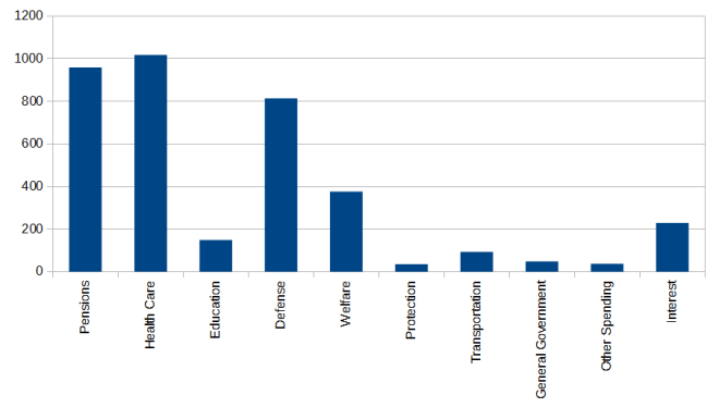
Let’s just look at federal spending for now. Including veterans’ benefits, we currently spend $814 billion per year on defense. On Social Security, we spend $959 billion. On healthcare, we spend $1,018 billion per year, of which $536 billion is Medicare.

We also spend $376 billion on social welfare programs and unemployment, along with $149 billion on education, $229 billion servicing the national debt, and $214 billion on everything else (such as police, transportation, and administration).

I’ve made you a graph that accurately reflects these relative quantities:

US_federal_spending

As you can see, the military is one of our major budget items, but the largest categories are actually pensions (i.e. Social Security) and healthcare (i.e. Medicare and Medicaid).

Given the right year and properly adjusted bars on the graph, the meme may strictly be accurate about the discretionary budget, but it gives an extremely distorted sense of our overall government spending.

The next meme is even worse:

Lee_Camp_meme

Again the figures aren’t strictly wrong if you use the right year, but we’re only looking at the federal discretionary budget. Since basically all military spending is federal and discretionary, but most education spending is mandatory and done at the state and local level, this is an even more misleading picture.

Total annual US military spending (including veteran benefits) is about $815 billion.
Total US education spending (at all levels) is about $922 billion.

Here’s an accurate graph of total US government spending at all levels:

US_total_spending

That is, we spend more on education than we do on the military, and dramatically more on healthcare.

However, the United States clearly does spend far too much on the military and probably too little on education; the proper comparison to make is to other countries.

Most other First World Countries spend dramatically more on education than they do on the military.

France, for example, spends about $160 billion per year on education, but only about $53 billion per year on the military—and France is actually a relatively militaristic country, with the 6th-highest total military spending in the world.

Germany spends about $172 billion per year on education, but only about about $44 billion on the military.

In absolute figures, the United States overwhelms all other countries in the world—we spend as much as at least the next 10 combined.

Using figures from the Stockholm International Peace Research Institute (SIPRI), the US spends $610 billion of the world’s total $1,776 billion, meaning that over a third of the world’s military spending is by the United States.

This is a graph of the top 15 largest military budgets in the world.

world_military_spending

One of these things is not like the other ones…

It probably makes the most sense to compare military spending as a portion of GDP, which makes the US no longer an outlier worldwide, but still very high by First World standards:

world_military_spending_GDP

If we do want to compare military spending to other forms of spending, I think we should do that in international perspective as well. Here is a graph of education spending versus military spending as a portion of GDP, in several First World countries (military from SIPRI and the CIA, and education from the UNDP):

world_military_education

Our education spending is about average (though somehow we do it so inefficiently that we don’t provide college for free, unlike Germany, France, Finland, Sweden, or Norway), but our military spending is by far the highest.

How about a meme about that?