JDN 2457324 EDT 21:45
You may have noticed a couple of big changes in the blog today. The first is that I’ve retitled it “Human Economics” to emphasize the positive, and the second is that I’ve moved it to my domain http://patrickjuli.us which is a lot shorter and easier to type. I’ll be making two bite-sized posts a week, just as I have been piloting for the last few weeks.
Earlier today I was dismayed to see a friend link to this graph by the American Enterprise Institute (a well-known Libertarian think-tank):

Look! The “above $100,000” is the only increasing category! That means standard of living in the US is increasing! There’s no inequality problem!
The AEI has an agenda to sell you, which is that the free market is amazing and requires absolutely no intervention, and government is just a bunch of big bad meanies who want to take your hard-earned money and give it away to lazy people. They chose very carefully what data to use for this plot in order to make it look like inequality isn’t increasing.
Here’s a more impartial way of looking at the situation, the most obvious, pre-theoretical way of looking at inequality: What has happened to mean income versus median income?
As a refresher from intro statistics, the mean is what you get by adding up the total money and dividing by the number of people; the median is what a person in the exact middle has. So for example if there are three people in a room, one makes $20,000, the second makes $50,000, and the third is Bill Gates making $10,000,000,000, then the mean income is $3,333,333,356 but the median income is $50,000. In a distribution similar to the power-law distribution that incomes generally fall into, the mean is usually higher than the median, and how much higher is a measure of how much inequality there is. (In my example, the mean is much higher, because there’s huge inequality with Bill Gates in the room.) This confuses people, because when people say “the average”, they usually intend the mean; but when they say “the average person”, they usually intend the median. The average person in my three-person example makes $50,000, but the average income is $3.3 billion.
So if we look at mean income versus median income in the US over time, this is what we see:
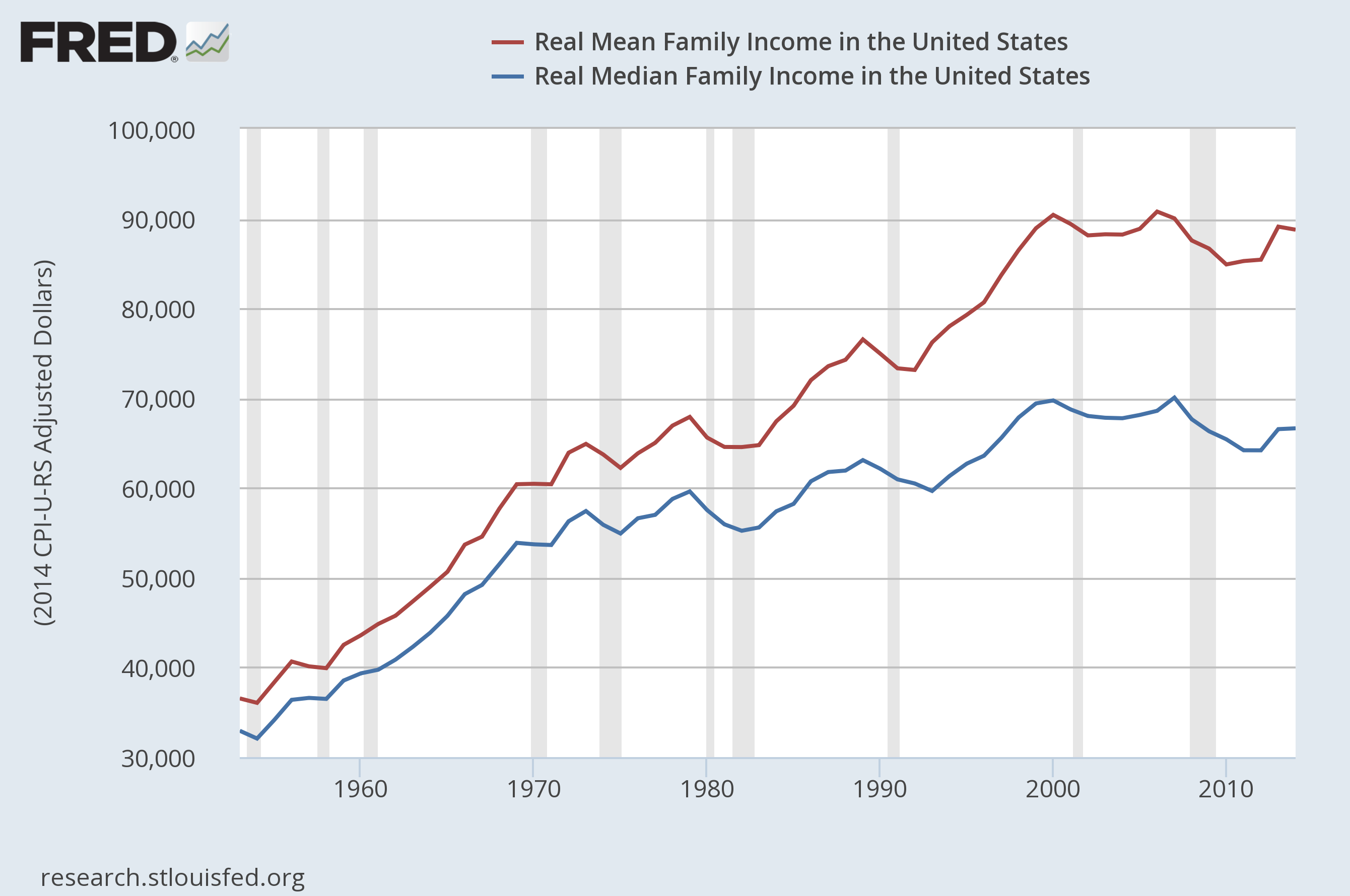
In 1953, mean household income was $36,535 and median household income was $32,932. Mean income was therefore 10.9% higher than median income.
In 2013, mean household income was $88,765 and median income was $66,632. Mean household income was therefore 33.2% higher than median income.
That, my dear readers, is a substantial increase in inequality. To be fair, it’s also a substantial increase in standard of living; these figures are already adjusted for inflation, so the average family really did see their standard of living roughly double during that period.
But this also isn’t the whole story.
First, notice that real median household income is actually about 5% lower now than it was in 2007. Real mean household income is also lower than its peak in 2006, but only by about 2%. This is why in a real sense we are still in the Second Depression; income for most people has not retained its pre-recession peak.
Furthermore, real median earnings for full-time employees have not meaningfully increased over the last 35 years; in 1982 dollars, they were $335 in 1979 and they are $340 now:
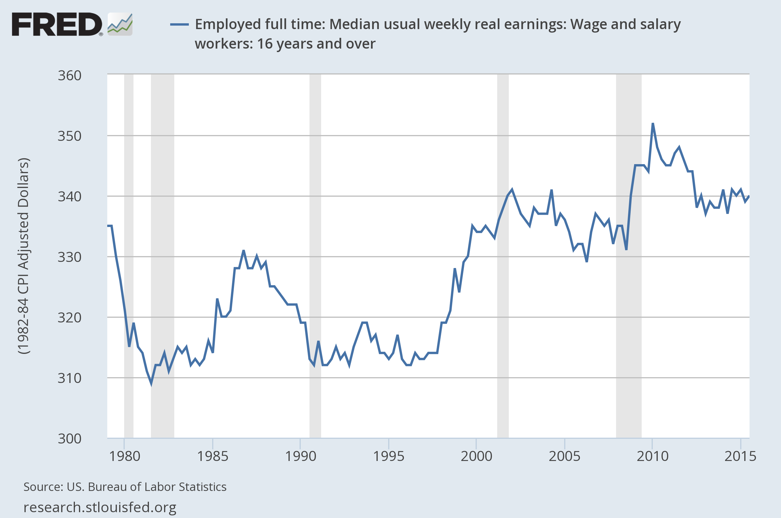
At first I thought this was because people were working more hours, but that doesn’t seem to be true; average weekly hours of work have fallen from 38.2 to 33.6:

The main reason seems to be actually that women are entering the workforce, so more households have multiple full-time incomes; while only 43% of women were in the labor force in 1970, almost 57% are now.

I must confess to a certain confusion on this point, however, as the difference doesn’t seem to be reflected in any of the measures of personal income. Median personal income was about 41% of median family income in 1974, and now it’s about 43%. I’m not sure exactly what’s going on here.

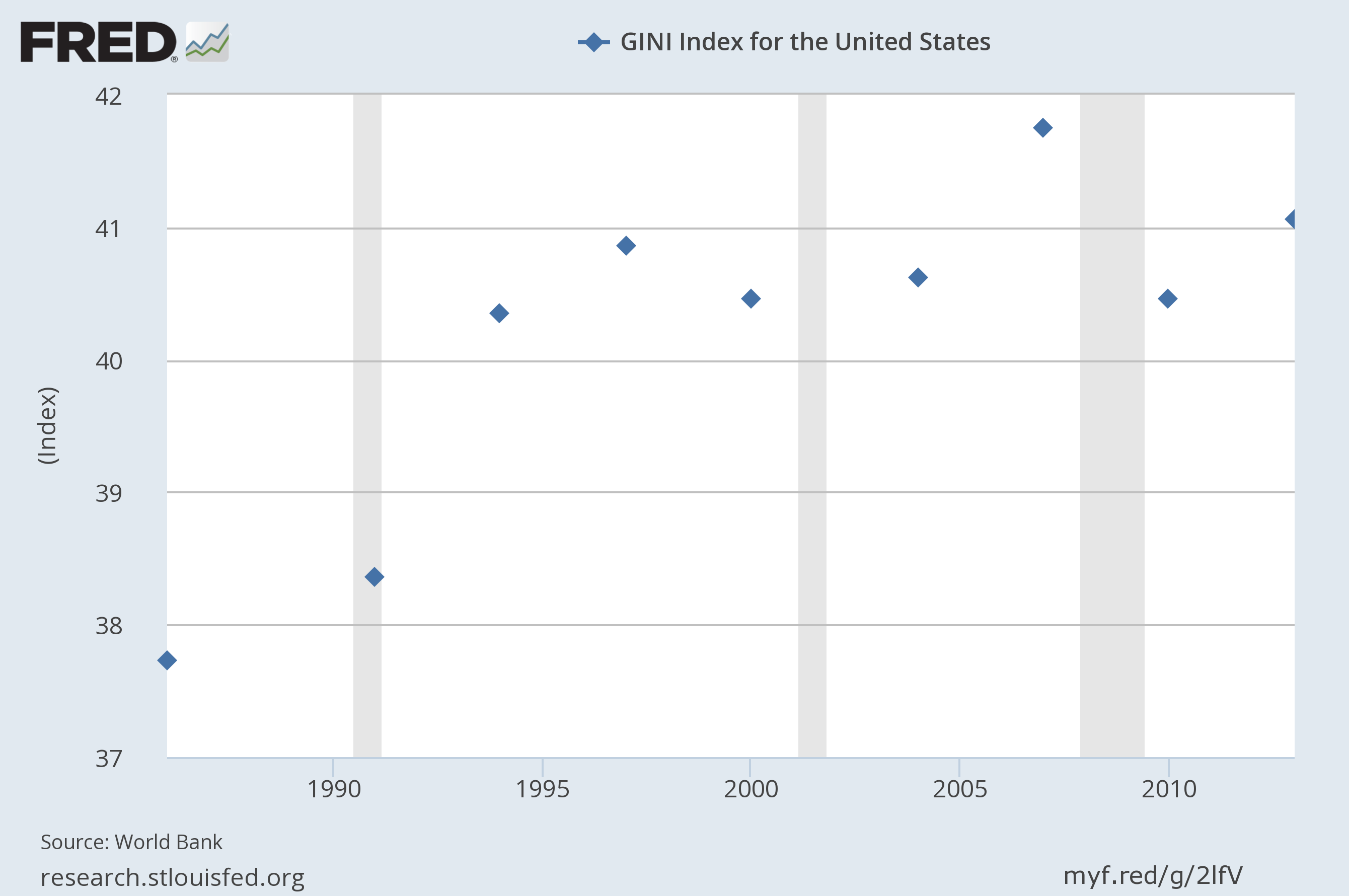
The Gini index, a standard measure of income inequality, is only collected every few years, yet shows a clear rising trend from 37% in 1986 to 41% in 2013:
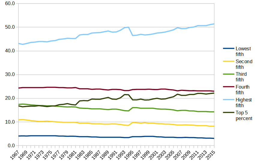
But perhaps the best way to really grasp our rising inequality is to look at the actual proportions of income received by each portion of the population.
This is what it looks like if you use US Census data, broken down by groups of 20% and the top 5%; notice how since 1977 the top 5% have taken in more than the 40%-60% bracket, and they are poised to soon take in more than the 60%-80% bracket as well:
The result is even more striking if you use the World Top Incomes Database. You can watch the share of income rise for the top 10%, 5%, 1%, 0.1%, and 0.01%:

But in fact it’s even worse than it sounds. What I’ve just drawn double-counts a lot of things; it includes the top 0.01% in the top 0.1%, which is in turn included in the top 1%, and so on. If you exclude these, so that we’re only looking at the people in the top 10% but not the top 5%, the people in the top 5% but not the top 1%, and so on, something even more disturbing happens:
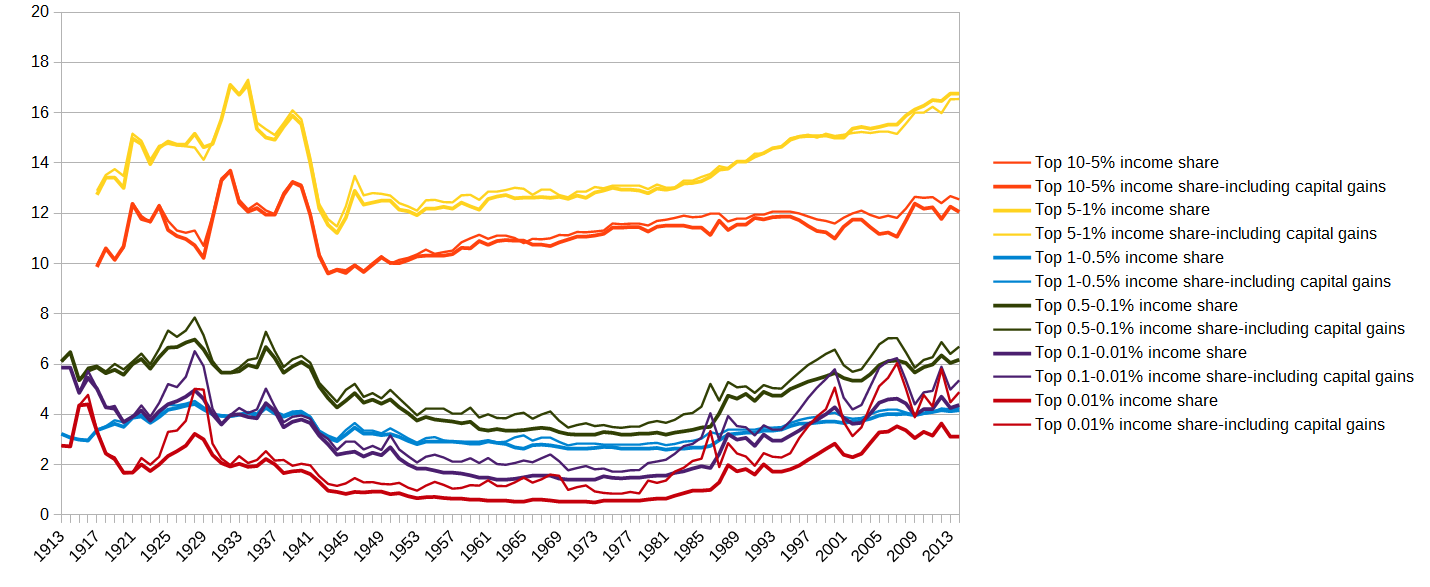
While the top 10% does see some gains, the top 5% gains faster, and the gains accrue even faster as you go up the chain.
Since 1970, the top 10%-5% share grew 10%. The top 0.01% share grew 389%.
|
Year |
Top 10-5% share |
Top 10-5% share incl. cap. gains |
Top 5-1% share |
Top 5-1% share incl cap. gains |
Top 1-0.5% share |
Top 1-0.5% share incl. cap. gains |
Top 0.5-0.1% share |
Top 0.5-0.1% share incl. cap. gains |
Top 0.1-0.01% share |
Top 0.1-0.01% share incl. cap. gains |
Top 0.01% share |
Top 0.01% share incl. cap. gains |
|
1970 |
11.13 |
10.96 |
12.58 |
12.64 |
2.65 |
2.77 |
3.22 |
3.48 |
1.41 |
1.78 |
0.53 |
1 |
|
2014 |
12.56 |
12.06 |
16.78 |
16.55 |
4.17 |
4.28 |
6.18 |
6.7 |
4.38 |
5.36 |
3.12 |
4.89 |
|
Relative gain |
12.8% |
10.0% |
33.4% |
30.9% |
57.4% |
54.5% |
91.9% |
92.5% |
210.6% |
201.1% |
488.7% |
389.0% |
To be clear, these are relative gains in shares. Including capital gains, the share of income received by the top 10%-5% grew from 10.96% to 12.06%, a moderate increase. The share of income received by the top 0.01% grew from 1.00% to 4.89%, a huge increase. (Yes, the top 0.01% now receive almost 5% of the income, making them on average almost 500 times richer than the rest of us.)
The pie has been getting bigger, which is a good thing. But the rich are getting an ever-larger piece of that pie, and the piece the very rich get is expanding at an alarming rate.
It’s certainly a reasonable question what is causing this rise in inequality, and what can or should be done about it. By people like the AEI try to pretend it doesn’t even exist, and that’s not economic policy analysis; that’s just plain denial.
