JDN 2457408
Or maybe it’s Ford?
The title is intentionally hyperbolic; despite the best efforts of Reagan and his ilk, America does yet survive. Indeed, as Obama aptly pointed out in his recent State of the Union, we appear to be on an upward trajectory once more. And as you’ll see in a moment, many of the turning points actually seem to be Gerald Ford, though it was under Reagan that the trends really gained steam.
But I think it’s quite remarkable just how much damage Reaganomics did to the economy and society of the United States. It’s actually a turning point in all sorts of different economic policy measures; things were going well from the 1940s to the 1970s, and then suddenly in the 1980s they take a turn for the worse.
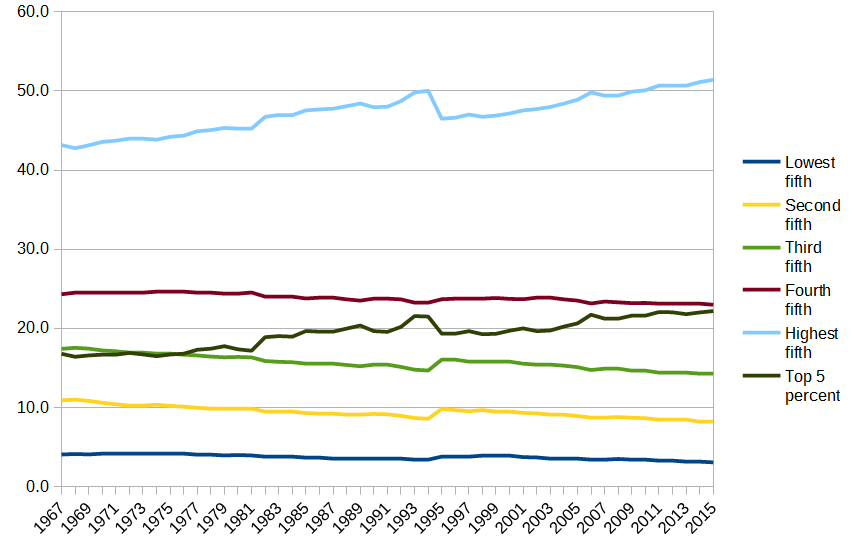
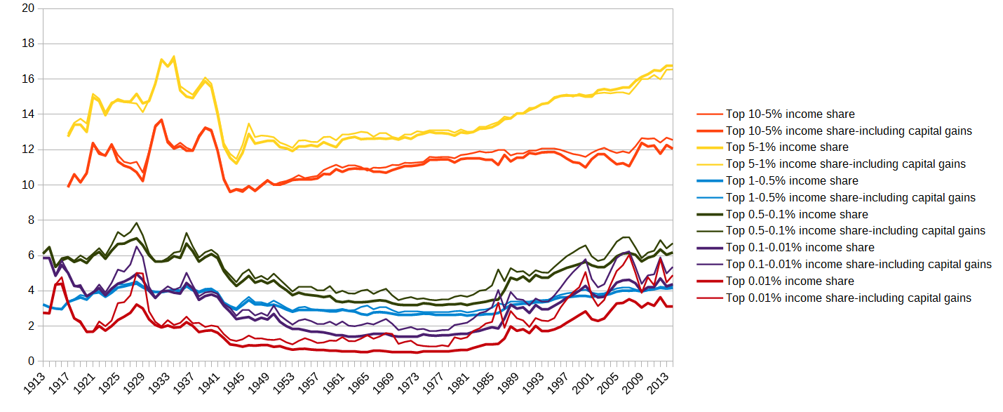
The clearest example is inequality. From the World Top Incomes Database, here’s the graph I featured on my Patreon page of income shares in the United States:

Inequality was really bad during the Roaring Twenties (no surprise to anyone who has read The Great Gatsby), then after the turmoil of the Great Depression, the New Deal, and World War 2, inequality was reduced to a much lower level.
During this period, what I like to call the Golden Age of American Capitalism:
Instead of almost 50% in the 1920s, the top 10% now received about 33%.
Instead of over 20% in the 1920s, the top 1% now received about 10%.
Instead of almost 5% in the 1920s, the top 0.01% now received about 1%.
This pattern continued to hold, remarkably stable, until 1980. Then, it completely unraveled. Income shares of the top brackets rose, and continued to rise, ever since (fluctuating with the stock market of course). Now, we’re basically back right where we were in the 1920s; the top 10% gets 50%, the top 1% gets 20%, and the top 0.01% gets 4%.
Not coincidentally, we see the same pattern if we look at the ratio of CEO pay to average worker pay, as shown here in a graph from the Economic Policy Institute:

Up until 1980, the ratio in pay between CEOs and their average workers was steady around 20 to 1. From that point forward, it began to rise—and rise, and rise. It continued to rise under every Presidential administration, and actually hit its peak in 2000, under Bill Clinton, at an astonishing 411 to 1 ratio. In the 2000s it fell to about 250 to 1 (hurray?), and has slightly declined since then to about 230 to 1.
By either measure, we can see a clear turning point in US inequality—it was low and stable, until Reagan came along, when it began to explode.
Part of this no doubt is the sudden shift in tax rates. The top marginal tax rates on income were over 90% from WW2 to the 1960s; then JFK reduced them to 70%, which is probably close to the revenue-maximizing rate. There they stayed, until—you know the refrain—along came Reagan, and by the end of his administration he had dropped the top marginal rate to 28%. It then was brought back up to about 35%, where it has basically remained, sometimes getting as high as 40%.

Another striking example is the ratio between worker productivity and wages. The Economic Policy Institute has a very detailed analysis of this, but I think their graph by itself is quite striking:

Starting around the 1970s, and then rapidly accelerating from the 1980s onward, we see a decoupling of productivity from wages. Productivity has continued to rise at more or less the same rate, but wages flatten out completely, even falling for part of the period.
For those who still somehow think Republicans are fiscally conservative, take a look at this graph of the US national debt:
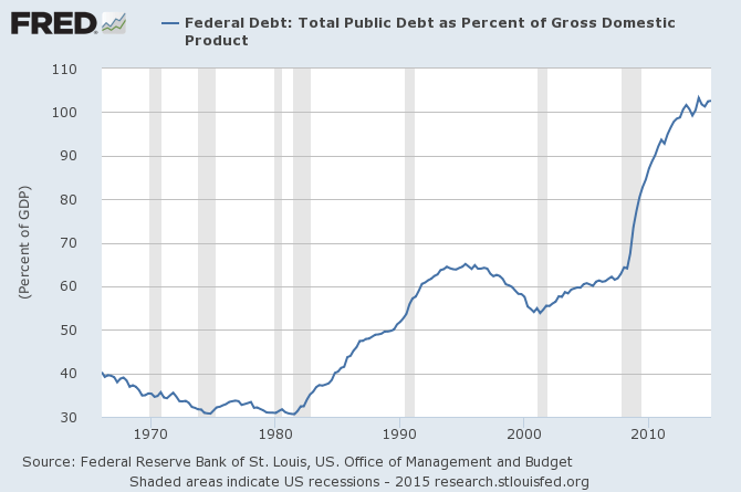
We were at a comfortable 30-40% of GDP range, actually slowly decreasing—until Reagan. We got back on track to reduce the debt during the mid-1990s—under Bill Clinton—and then went back to raising it again once George W. Bush got in office. It ballooned as a result of the Great Recession, and for the past few years Obama has been trying to bring it back under control.
Of course, national debt is not nearly as bad as most people imagine it to be. If Reagan had only raised the national debt in order to stop unemployment, that would have been fine—but he did not.
Unemployment had never been above 10% since World War 2 (and in fact reached below 4% in the 1960s!) and yet all the sudden hit almost 11%, shortly after Reagan:

Let’s look at that graph a little closer. Right now the Federal Reserve uses 5% as their target unemployment rate, the supposed “natural rate of unemployment” (a lot of economists use this notion, despite there being almost no empirical support for it whatsoever). If I draw red lines at 5% unemployment and at 1981, the year Reagan took office, look at what happens.

For most of the period before 1981, we spent most of our time below the 5% line, jumping above it during recessions and then coming back down; for most of the period after 1981, we spent most of our time above the 5% line, even during economic booms.
I’ve drawn another line (green) where the most natural break appears, and it actually seems to be the Ford administration; so maybe I can’t just blame Reagan. But something happened in the last quarter of the 20th century that dramatically changed the shape of unemployment in America.
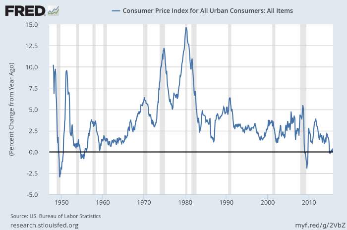
Inflation is at least ambiguous; it was pretty bad in the 1940s and 1950s, and then settled down in the 1960s for awhile before picking up in the 1970s, and actually hit its worst just before Reagan took office:
Then there’s GDP growth.

After World War 2, our growth rate was quite volatile, rising as high as 8% (!) in some years, but sometimes falling to zero or slightly negative. Rates over 6% were common during booms. On average GDP growth was quite good, around 4% per year.
In 1981—the year Reagan took office—we had the worst growth rate in postwar history, an awful -1.9%. Coming out of that recession we had very high growth of about 7%, but then settled into the new normal: More stable growth rates, yes, but also much lower. Never again did our growth rate exceed 4%, and on average it was more like 2%. In 2009, Reagan’s record recession was broken with the Great Recession, a drop of almost 3% in a single year.
GDP per capita tells a similar story, of volatile but fast growth before Reagan followed by stable but slow growth thereafter:

Of course, it wouldn’t be fair to blame Reagan for all of this. A lot of things have happened in the late 20th century, after all. In particular, the OPEC oil crisis is probably responsible for many of these 1970s shocks, and when Nixon moved us at last off the Bretton Woods gold standard, it was probably the right decision, but done at a moment of crisis instead of as the result of careful planning.
Also, while the classical gold standard was terrible, the Bretton Woods system actually had some things to recommend it. It required strict capital controls and currency exchange regulations, but the period of highest economic growth and lowest inequality in the United States—the period I’m calling the Golden Age of American Capitalism—was in fact the same period as the Bretton Woods system.
Some of these trends started before Reagan, and all of them continued in his absence—many of them worsening as much or more under Clinton. Reagan took office during a terrible recession, and either contributed to the recovery or at least did not prevent it.
The President only has very limited control over the economy in any case; he can set a policy agenda, but Congress must actually implement it, and policy can take years to show its true effects. Yet given Reagan’s agenda of cutting top tax rates, crushing unions, and generally giving large corporations whatever they want, I think he bears at least some responsibility for turning our economy in this very bad direction.