Apr 26 JDN 246157
This shocking story has been making the rounds: There is a website where men plan to drug and rape their wives. It’s being called the “rape academy”.
There is a factoid in the original reporting that has people especially shocked: The website that hosted this terrifying content had 62 million visitors in just one month!
A lot of people seem to be taking this to mean that there are 62 million rapists on that website—a number so huge that, since it’s just one site and there could be many more out there, would seem to imply that a large fraction of men—or even the majority of men—are in fact rapists.
But this is completely false.
That is not what that figure means, and it is an utterly preposterous claim to begin with.
I consider it deeply irresponsible journalism to report that 62 million figure without clarification.
The site that had 62 million visitors last month is a mainstream porn site. It seems to have very poor moderation policies, and as a result users were getting away with posting this “rape academy” content on it. But the number of users who actually participated in that content was not 62 million—it was not anywhere near 62 million. It was in fact only a few thousand. This is the difference between the population of a small town and the population of France.
The story here is not “there are a huge number of rapists out there and any man you know could be implicated”. The story here is mainstream porn sites are not properly moderating their content.
Of course it’s horrible that there are any rapists in the world. But that has always been true, probably will always be true, and ultimately all we can do is try to find ways to reduce those numbers while knowing that they will never actually reach zero.
Yet the public reaction to this story seems to have completely misunderstood this.
I am particularly disturbed by Greta Christina’s response (and she is someone that I greatly respect, and whose blog I follow quite carefully):
And every time I passed a man, I thought, “Are you one of them? There were 62 million visits to the rape academy site, in one month alone. Were you one of them? Are you, not just a rapist, but a calculating, plan-ahead rapist who conspires with other men on how to commit rape?”
[…]
Comment policy: Do not try to console or reassure me. Right now that feels like gaslighting. And if I hear one whiff of “Not all men,” I will block you so hard and so fast you’ll hear the explosion on the other side of the world.
She has swallowed this false narrative that it’s 62 million rapists, and categorically refuses to be corrected on that. In fact, she says that any attempt to do so feels like gaslighting.
In fact, since there were only 1,000 participants in the “rape academy”, the probability that any man Greta Christina has ever encountered was one of them is negligible. The probability that she encountered a man who had visited that porn site is considerably higher—but that’s a very different thing entirely.
Say what you will about porn sites; there is a lot of legitimate criticism to be had there. I consider myself a sex-positive feminist, and yet I still have a lot of concerns about how the porn industry is run. But millions of men consuming perfectly legal sexual content is a completely different thing from millions of men committing premeditated rape.
Moreover, Christina is far from alone in this. I have seen a huge amount of discourse on this where someone tries to correct the obviously preposterous figure, and then a bunch of people attack them for it, saying things like:
“If you are arguing statistics, you are part of the problem.”
Seriously? Trying to get accurate figures on the prevalence of rape makes you complicit in rape? Is that what you really meant to say? Shouldn’t getting accurate figures in fact be part of the solution?
The criminology statistics on this are very clear:
The vast majority of men are not rapists.
The reason that a large fraction of women are victims of rape (the best estimates are about 20%, though you’ll often hear higher figures from less credible sources) is that rapists generally rape multiple times before they are caught. That’s a big problem! It says something very bad about how our criminal justice system operates. But it absolutely, categorically, does not mean that 20% of men are rapists.
And yes, basically all women feel vulnerable to rape and try to protect themselves from it. So in that sense, all women are affected. But it doesn’t take all men to make all women feel threatened.
In fact, the best estimates we have suggest that about 8% of men have ever committed rape. That’s honestly higher than I would have expected (my guess would have been 5%). But it still implies that over 90% of men are not rapists.
(Since the world population is over 8 billion, half of people are male, and most people are adults, the 8% figure does mean that there are in fact about 300 million rapists in the world—but there’s absolutely no way that one-fifth of all rapists in the world are on a single website coordinating their activities!)
I don’t think this is really that hard to understand; it’s the same pattern as other crimes.
What proportion of people have been victims of theft? Probably the majority, depending on the seriousness of the theft.
And basically everyone feels a need to protect themselves against theft, locking their homes and cars, keeping a close eye on their valuables, avoiding dark alleys at night, and so on.
But what proportion of people are thieves? Maybe most people have shoplifted at some point, but in terms of real, serious theft, like stealing a car or breaking into a home? Only a tiny fraction. The reason that so many people have been victimized and everyone needs to be careful is that thieves do it many times before they are stopped.
In fact, it’s fair to say that this is more true of theft than it is of rape— much less than 8% of people are car thieves or burglars, and most rapes are committed by men known to the victim, which is surely not true of serious theft. But still, over 90% of men are not rapists.
This doesn’t necessarily mean that all other men are off the hook.
I actually really like this chart (which unfortunately I was unable to find in higher resolution, because Threads wouldn’t cooperate and I couldn’t find it anywhere else):
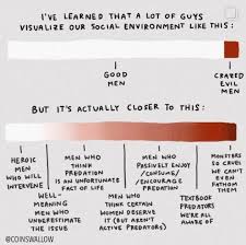
I have some quibbles with the categorization, to be sure: Why does “men who think predation is an unfortunate fact of life” make you worse than “well-meaning men who underestimate the issue”? Surely in some sense it is true that predation is an unfortunate fact of life: We’re never going to get that number to zero, no matter what we do. We can hopefully make it smaller, but a world with zero rapes implies some kind of global totalitarian police state (and frankly an especially benevolent and competent one at that). But maybe the intent here is that these men think there is nothing we can do to reduce rape at all, which does sound bad.
Also, what exactly does “enjoy/consume/encourage predation” mean? “enjoy/consume” seems like it could apply to rape fantasy content, which isn’t illegal—and is actually extremely popular among both men and women. I guess if we mean men who consume and enjoy actual rape content (like the “rape academy”); that sounds really bad, but it also can’t be all that many men.
But in general, I think this is a much more accurate view than either the one which says that most men aren’t rapists and therefore don’t need to do anything differently, or the view that most men are rapists and need to be taught or convinced to stop being rapists. Most men aren’t rapists, but there’s still more that they could be doing to help.
If I had to put figures on these, my guesses would be about this:
- Heroic men who would intervene: 10-20%
- Well-meaning men who underestimate the issue: 25-35%
- Men who think there is nothing we can do about rape: 10-20%
- Men who think certain women deserve it: 15-25%
- Men who passively consume rape content: 5-10%
- Textbook predators we’re all aware of: 5-10%
- Monsters so cruel we can’t even fathom them: 1-2%
This still means that the chart is skewed; the worst categories should be much smaller than the best ones.
I might even add a better category, men who have intervened, which would surely be much smaller than the category of men who would intervene—because, contrary to the apparent belief of most feminists, most men really don’t get a lot of opportunities to intervene to stop rape. Rape happens in private, and generally rapists don’t advertise that they are planning on it or even that they have done it. Out of all the men I know in my life, only a handful of them would I reasonably suspect of committing rape at some point in their lives, and I have neither confessions nor compelling evidence to support the accusation for any of them. All I can say is they seem like the sort of man who would be willing to commit rape. (One of them I’m firmly convinced is a full-blown psychopath.) So while I absolutely would intervene to stop them if I had the opportunity to do so, I simply haven’t ever had that opportunity.
Actually I think men are even less aware of which men are dangerous than women, because women seem to have whisper networks that share this kind of information, but they rarely think to include any men in those networks. Maybe they don’t trust us enough? But I don’t understand how I’m expected to intervene when nobody has even told me who I should be intervening against.
It’s also quite likely—in fact, I dare say, nearly certain—that my own social networks are not representative of male social networks. Maybe more conventionally masculine cishet men who hang out in clubs and bars have more opportunities to intervene against rapists. It’s probably the case that most men have more experience of other men bragging about their sexual exploits in ways that may suggest predation (I have almost never experienced this, in fact).
So here’s my updated chart (which I also added more colors to, to make it clearer):
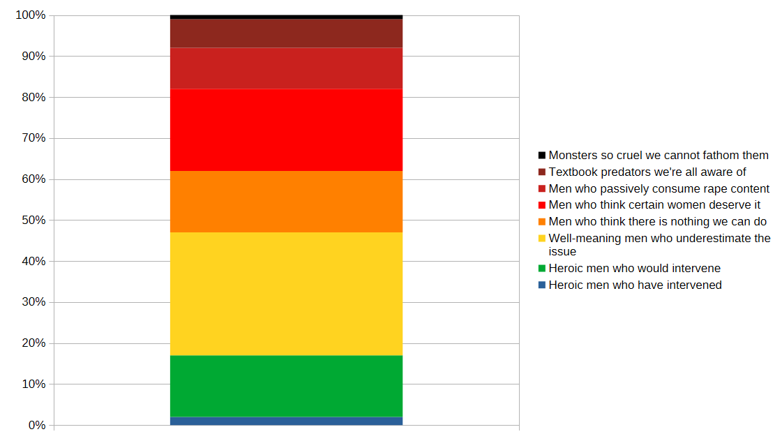
This still means that there is a lot we could do to make things better—especially about the “men who think some women deserve it” and “well-meaning men who underestimate the issue” categories, which are (in my estimation) the largest. But it’s a far cry from “any man you meet could be one of them” or “just teach men not to rape”.
And it’s never a good sign when trying to correct egregious misunderstandings is characterized as “gaslighting”.


